
Another real-life use case shared by one of our customers.
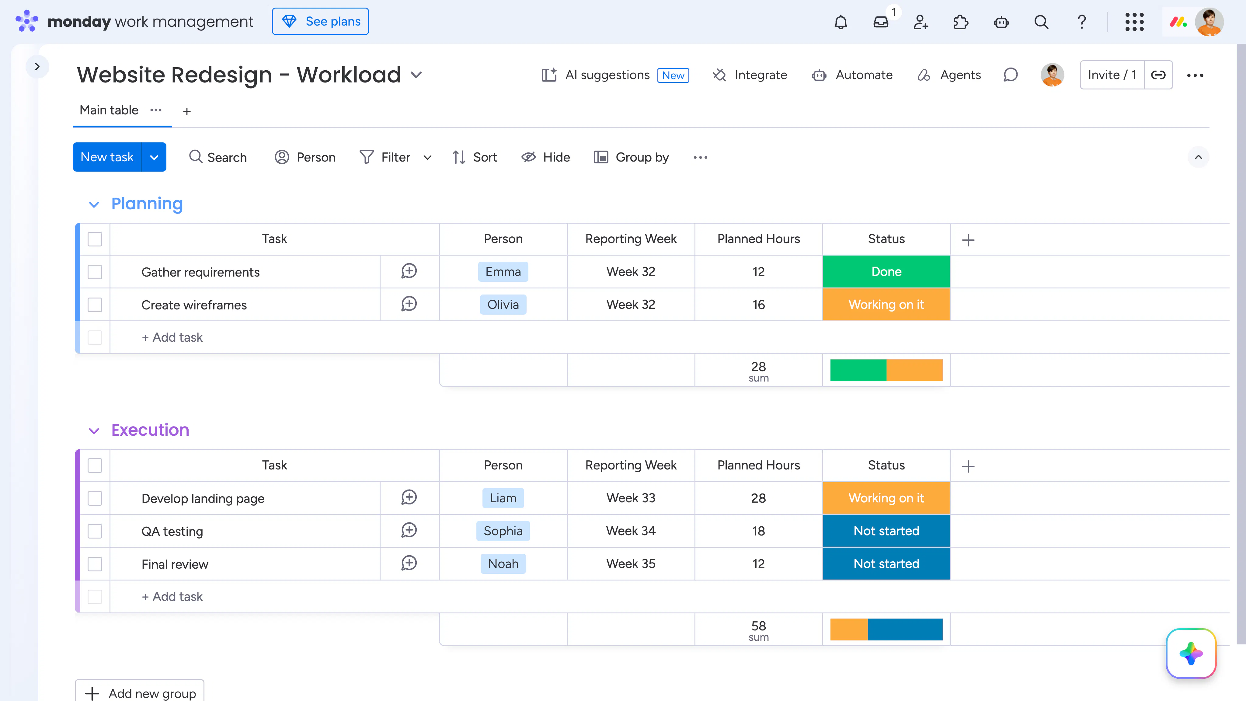
They manage each project on a separate monday.com board, with groups representing project phases such as Planning, Execution, and Delivery. Besides the usual task information, each board contains project-specific fields such as budgets, customer details, logistics, and other operational data.
To get an overview across all projects, they use Smart Spreadsheet as a Dashboard widget.
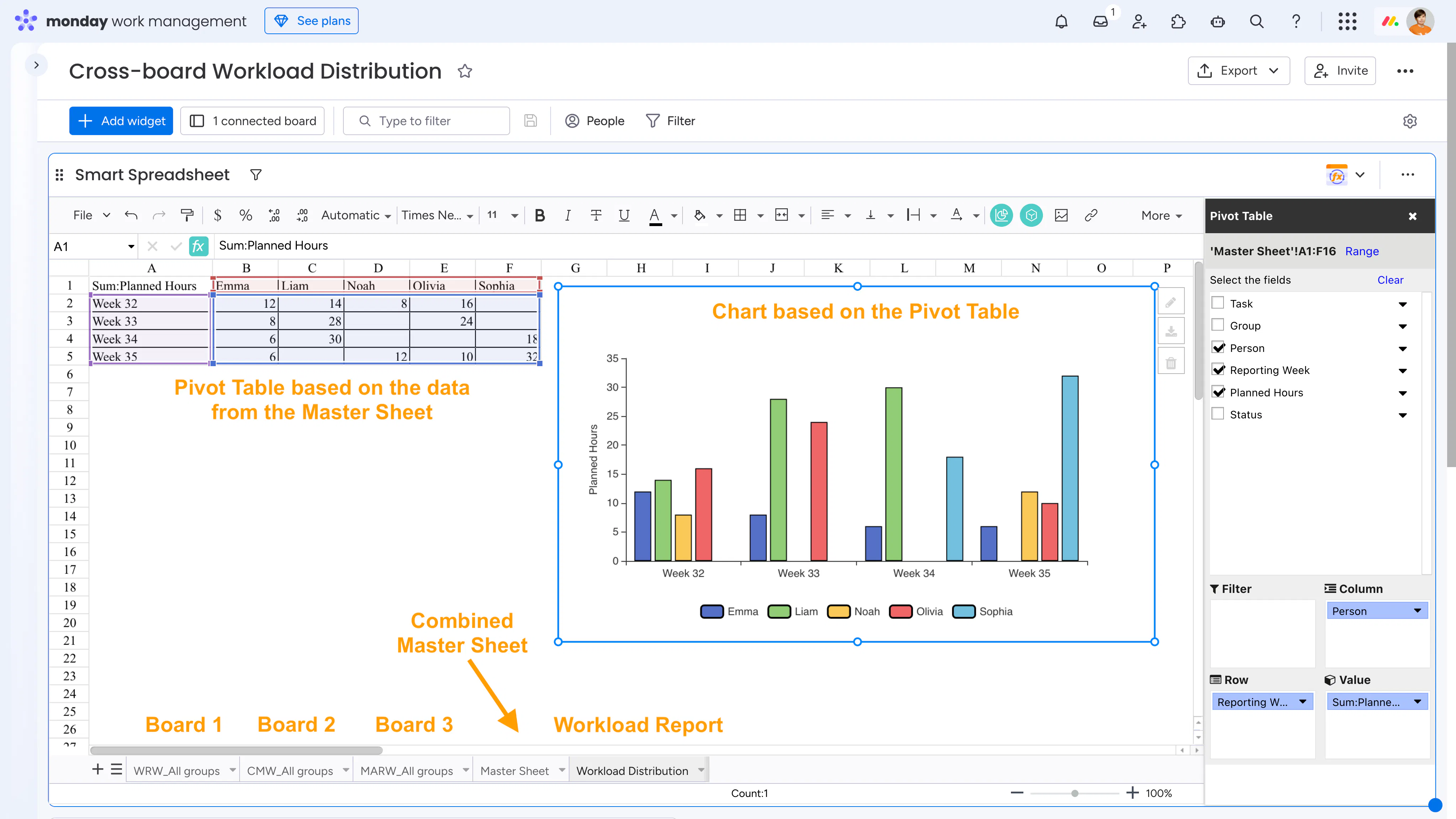
First, they import live data from each board, placing all groups from the same board onto a single worksheet. Then they create a Master Sheet by linking those worksheets with familiar Excel-style references, such as: ='Your board name_All groups'!A1.
From there, they can build as many reports as they need using Pivot Tables, formulas, and charts. Financial summaries, status overviews, project metrics - you name it. Every report lives in its own worksheet, all inside a single Dashboard widget, and stays synchronized with monday.com.
One of those reports is a simple team workload overview.
Each task already includes an assignee, a reporting week, and planned hours, so creating the report is straightforward. A Pivot Table summarizes planned hours by team member and reporting week, and a chart instantly highlights who is overloaded and who has available capacity.
Of course, monday.com's Workload Widget is a great solution for resource management. In this case, however, the customer preferred keeping workload analysis alongside their financial, operational, and project reports in the same Smart Spreadsheet, without adding another Dashboard widget.
We thought this was a clever example of how a familiar spreadsheet approach can complement monday.com dashboards. Hopefully, it gives you a few ideas for your own reporting setup!