Same here. I have deleted and re-added columns, created formula columns, etc just to make the colors match. I have been mostly successful, but still a lot work. Short of having the ability to control the numbers, can we have an explanation of how the colors are chosen so we can control column selection to align with the colors we want?
1 Like
I’ve just requested the same thing as i hadn’t found your post. this is such an obvious requirement. i don’t understand why it’s not available yet.
1 Like
Please add this functionality. It is an important way to communicate infromation.
1 Like
Please add this functionality
+1 this is such a simple and obvious feature but MADDENING when you realize you don’t have it!
1 Like
I just discovered this missing feature today, and I’m amazed it doesn’t exist. My pie chart is pulling items from another connected board and the colors don’t match the color of the group that they’re coming from, which is maddening.
I want time tracking issues fixed first, but this next!
2 Likes
Would also love to see this happen! It’s essential when trying to compare information and understand what we are viewing.
+1 please add this feature, being able to adjust colours in general through a hex code instead of the pre-set colours in boards and dashboards would make a huge difference
PLEASE PLEASE PLEASE Add this feature ASAP. I am trying to show the RAG status of projects (Red, Amber and Green) but it’s very confusing when your label show projects in Red but the pie chart is showing them in blue or green and same for the others…
1 Like
Super important feature, I could insert charts in presentations (screenshot) if I could control their colors. As it is I can’t use the dashboard at all.
I can’t believe you can’t change the colors! We want to show a pass/fail chart with green and red. Is super confusing to have yellow and blue.
Please roll this out soon!! I can’t use dashboards because of this, will probably try pull data into google sheets or something, so painful. Makes we want to change off Monday.com to another product.
2 Likes
Absolutely this. It’s really surprising to me that we can’t edit the chart colors. It’s a necessary functionality.
Yes, we desperately need ability to change the color schema to match our company’s branding requirements.
1 Like
+1 doesn’t seem like a big feature update and hopefully Monday.com can have this implemented sooner than later
2 Likes
Please allow color customization of charts/dashboards. We prefer subdued colors - only complaint about Monday is these elementary school chart colors. Need to customize presentations for our university colors.
2 Likes
I’d like to have the ability to set colors of reports/dashboards manually. I work with several team members who are different degrees of color blind. They need severe contrasting colors to be able to tell them apart. The colors that the reports pull automatically are often way too close for them to differentiate.
1 Like
Please make dashboard charts and graphs customizable with color edits/theme choices. We need to tailor to our university’s color scheme. Thank you.
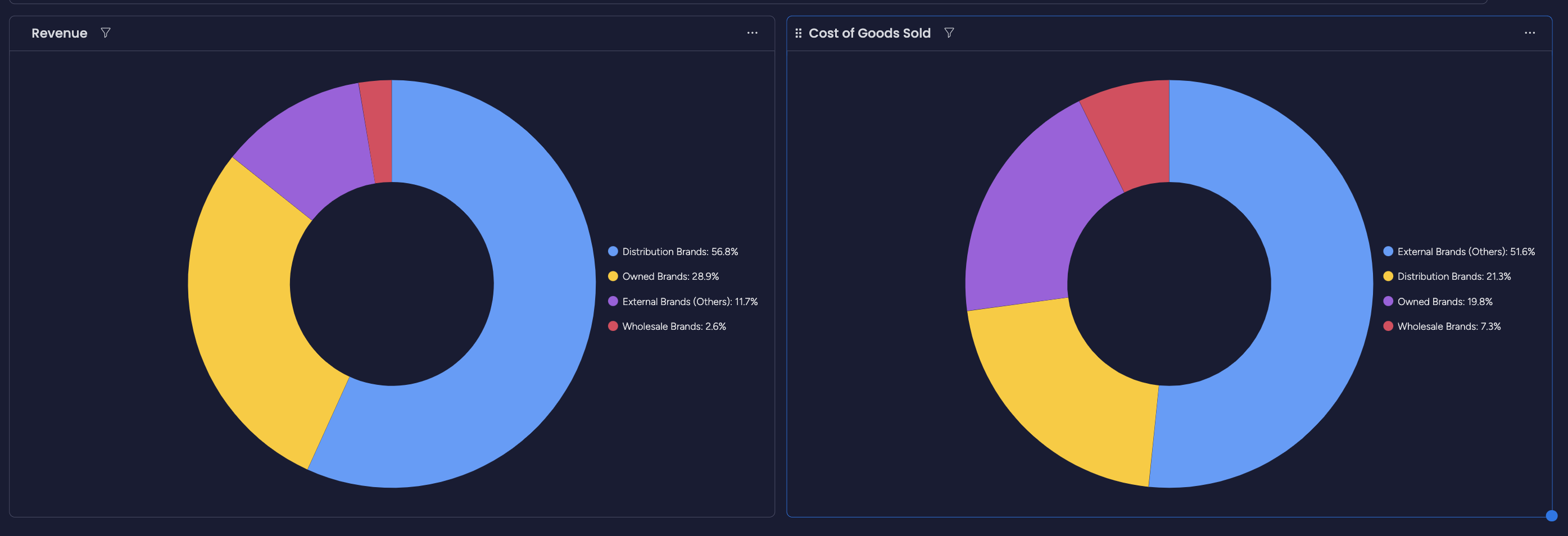
Need the feature to be able to keep items of the same name consistent across multiple charts on the same dashboard. Example I would like "Distribution Brands to remain Blue Across the chart
2 Likes
Here’s another great example! A pie chart with three shades of blue!
Also, I hate that I can’t adjust the placement of text so that it can be more readable, and the numbers are LEFT-JUSTIFIED.

1 Like
So true!! Where are we on this ! we need this feature very much!!! basic basic