Reports by Screenful — Beautiful custom reports with charts and diagrams for Monday

G’day Monday.com community! :wave:

Today I’m excited to share the Reports by Screenful app for Monday.com, which won a Staff Picks prize in the recent Monday Apps Challenge! :tada:

The app is an easy-to-use business intelligence solution for monday.com, which allows you to create reports of your task data and share them via email or Slack.

:point_right: Click here to install the app! :point_left:

You can use the app by creating a board view to your table and choosing Reports by Screenful as the view. You can use it as a standalone app in the browser, but you must have the app installed on Monday first.

If you have any questions or feedback — feel free to get in touch with us at support@screenful.com

Have a nice day and happy reporting! :heart:

The Reports by Screenful are available on Monday.com Marketplace!

If you spend any time constructing reports of your projects, you’ll find out this product can automate a large part of that manual work. You’ll have to set up a report once, and you’ll get the latest data delivered to your inbox at your preferred frequency.

How it works? — Watch demo

Getting Started — Start a free 21-day trial

Key features

Fully customizable reporting

With the new Reports product, we started with the assumption that the user wants to customize each and every detail. When it comes to reporting, one size does not fit all. That includes all the texts, charts, colors, and the overall layout.

The basic building block of a report is a custom chart. Since custom charts are highly customizable, that provides a good foundation for a customizable report. You can add any number of charts and reorder them by drag & drop. You can also add text fragments between the chart to include your own comments or descriptions.

A single report can contain as many charts and task lists as you wish, and you can combine data from multiple projects or boards.

Drag & drop report editor

In the new Reports product, you have two main navigation items on the top: Charts and Reports. You can create a new report by clicking Add new report on the top right when you’re in the Reports tab.

Once you’re in the editor, you can start adding sections to your report, with charts or text fragments.

You can add as many sections as you want, and you can configure each of them separately so that you can capture all key information in one report.

Schedule and share reports

In addition to viewing a report or downloading it as a PDF, reports can be scheduled to be shared via email or Slack (to start with, other tools will follow). To schedule a report, click the three dots next to any of the reports in the list and select Schedule from the menu.

The scheduling view is opened, which allows you to select the frequency (daily/weekly/monthly), and the time of day when the report will be sent.

Once the schedule is saved, the report will be sent as a PDF attachment via email to the selected recipients. When you click the attachment, the report is shown:

So, why wait…Install Reports by Screenful and send your ideas and feedback at hello@screenful.com

Track lead and cycle times of individual tasks ⌛

In the latest product update, we’ve added a new feature that allows tracking timings of individual tasks. That includes tracking lead and cycle times but also the amount of time a task has spent on any individual workflow state. That information is now available for all tasks, including those that are not yet completed.

Previously we provided timing information in the Timing screen only. Now these tooltips are available in all dashboard screens which have click throughs to individual tasks.

The feature is already available for all Monday users. Learn more from the release notes.

New release: Introducing Table chart with custom formulas for monday.com

Hi, folks. Today I’m very excited to share something cool with you:

You can now use a new chart type in Reports by Screenful. The new Table chart allows to view data in rows and columns. You can choose how your data is grouped into rows, and you can configure the columns to display exactly the information you need.

Here’s an example of a Table chart:

It is similar to a Pivot table as it aggregates the task data into sums, averages, and other statistics. It allows analyzing large amounts of task data in different ways rapidly. For example, you can track key metrics such as velocity and cycle times across your boards.

What makes this chart really powerful is that you can have as many columns as you want and configure them separately.

Adding a calculated column

The calculated column is a special type of column that displays data computed based on the other columns’ data. To add a calculated column, click Edit chart and scroll down to the column definitions. Click Add calculated column .

A modal is opened, which allows entering a mathematical formula .

In this example, the formula entered is

(DIVIDE( { 3 Tasks done }, { 1 Tasks total } ) )* 100

It means that the value in column 3 (Tasks done) is divided by the value in column 1 (Tasks total). The result should show the percentage of work completed.

While it may look complicated, you don’t really have to type it as you can click on the green buttons below the formula field, which provide shortcuts to the most commonly needed formulas. If you’re a power user looking for a more complicated formula, here’s a reference of all the supported formulas.

Once you’ve added the formula and saved the chart, the calculated column is added to the chart:

Now the rightmost column shows the completion percentage based on the values in the Tasks total and Tasks done columns.

When you write a calculated column formula, it is automatically applied to the whole table and evaluated individually for each row.

Formatting the calculated column

There are a couple of things you can do to spice up your calculated column. A more visual way of displaying percentages is by using progress bars. To change the representation, select Progress Bar (0-100) from the Format menu.

You can also change the column header from the default “Calculated” to a more descriptive one in the Chart format section.

Finally, you can reorder the columns by drag and drop. In the below example, we’ve renamed the column header to Progress and placed it as the first column in the chart. Here’s the final chart:

Summary

Table chart is now available for all users . With the Table chart, you can create progress lists for your projects, epics, team members, or whatever it is that you want to track. With configurable columns and support for formulas, it allows great flexibility.

To give it a try with your own data, sign up for a free 21-day trial.

As always, we’d love to hear from you. Please do not hesitate to contact us any time at hello@screenful.com if you have questions or feedback.

Have a productive week!

Introducing report templates :bar_chart:

Earlier this year we introduced chart templates to make it easier to create custom charts. That made it possible to create any chart from the underlying data with just a few clicks. Now we’ve expanded on that concept, and are extremely happy to introduce report templates! This is a game-changing feature as now you can create complete reports with just a few clicks.

Create new reports with just a few clicks

To create a new report from a template, go to the Reports tab and click Add new report on the top right corner.

A modal is opened with a set of report templates. You can either create a new report from scratch or pick one of the predefined reports.

Clicking one of report templates opens a preview with real data. You can select the data sources from the Data source menu above the report. You can pick one or more data sources for your reports and have them applied to all the charts within the report.

When you click Create report, the report is created and you can find it under the Reports tab under the main view.

From there, you can for example download it as a PDF, schedule it to be sent via email, or share it with others using the share links.

Configuring the report

While picking from the ready-made templates is the quickest way to get started, your use case may require a more customized approach. No worries, you can click the Configure icon on the top right corner to open the report for editing.

The report editor opens showing the predefined content. You can freely add or remove charts and text blocks, and adjust the layout of the report by adding columns to the report.

When you’re editing a report, you can easily insert any of your existing custom charts, or you can create new ones using the chart templates.

Summary

Report templates are now available for all users. You can easily create reports from templates and share them with others using share links and scheduled reports. We’ll be adding more templates to the library over time.

Introducing Analytics tab :rocket::sparkles:

We’re thrilled to announce that the new Analytics tab has progressed from beta and is now available for all users. It provides a quick overview of different aspects of your data so that you can start exploring without having to configure any charts or reports.

While the previously released Report templates made it easy to create content to share with others, the Analytics tab provides instant access to the key charts and metrics for your own consumption .

To begin with, the Analytics tab contains three sections, Completed work , Timings , and Key metrics .

Learn from chart summaries

Each chart comes with a summary text shown on the left side of the chart. The summary describes the data shown in the chart. If you are not certain what some number or label in the chart means, check the summary for more detail.

It is not always obvious what different numbers or labels in the chart actually mean. The chart summary explains it in plain English.

Click through to individual tasks

Summaries contain clickable links.

Clicking a link opens a modal displaying a list of tasks, revealing the data behind the numbers.

This is a great way to explore the data as you can first see the big picture in the chart, understand what the chart represents by reading the summary, and then click through to see the individual items behind the numbers.

Configure your personal view

The Analytics tab comes with its own settings and filters. You can access them by clicking the buttons on the top right.

Both the settings and the filters are personal to you only . Whatever you change here won’t have an effect on what others see. Consider the Analytics tab as your personal playground!

By default, the data is pulled from all of your data sources and you can narrow it down under the Data sources tab.

Summary

The Analytics tab contains a selection of charts that provides a quick and easy way for exploring your data. It is now available for all users. You can configure and filter the charts, and click through to see the individual items behind the numbers. Go ahead and give it a spin with your own data!

As always, we’d love to hear from you. Please do not hesitate to contact us any time at hello@screenful.com if you have questions or feedback.

To give it a try with your own data, sign up for a free 21 day trial

Introducing Stacked Area Chart, Cumulative Flow Diagram, dark mode for charts, and more! :chart_with_upwards_trend::waxing_crescent_moon:

In this October release, we want to highlight some of the recently introduced improvements to our custom charts. We’ve added two new charts to the growing library of our custom charts and made several improvements to the existing ones . These improvements are largely based on the feedback we’ve got from our users and we’d like to thank you all for your ideas and suggestions. Keep them coming :muscle:

Stacked Area Chart

We’ve had Stacked Area charts in our dashboards for a while already but now you can also create them as custom charts . They are great for visualizing trends of multiple grouped metrics such as task completions or cycle times per assignee, label, or any of your custom fields. Here’s an example chart:

In a stacked area chart, each area of color represents one part of the whole. As the name suggests, the parts are stacked up. The height of each colored stack represents the proportion of that grouped item at a given point in time. The colored areas are growing or shrinking as they move along the time axis, allowing you to see which color areas take up the largest and smallest slices of the overall total.

Cumulative Flow Diagram

The Cumulative Flow Diagram shows the amount of work in different stages of your workflow during the lifetime of your selected work scope. It allows to see the if work is piling up, or causing bottlenecks. Here’s an example chart:

The chart shows the amount of work completed vs work still in other states. Each colored area represents the number of tasks (or story points) in a specific workflow state at a given moment. The horizontal axis indicates time, and the vertical axis indicates the number of tasks. You can identify bottlenecks by looking at the widening areas in the chart. Here’s how to read this chart:

  • The chart is trending upwards because the done state (green color) is accumulating tasks over time. This is desirable. If it were flat, it would mean that the progress has stalled.
  • The other colored areas have roughly the same amount of work from day to day. This means that the throughput is stable and new tasks are entering the workflow in parallel to those that are leaving it.

The Cumulative Flow Diagram allows teams to visualize their effort and project progress, and to see if work is piling up or causing bottlenecks. It is an essential tool for assessing the health of a Kanban process.

Track multiple custom fields in a single chart

What if you have multiple custom fields and you want to have all of them in one chart? Let’s assume you want to compare the values of three different number fields over time. You can do that by adding them one by one.

In this example, we’ll use the multi-bar chart . Pick one of the custom fields as the unit for the chart. After that, use the Add custom field button to add the other two fields.

Here’s the final chart with three custom units, grouped by week:

The unit shown on the left axis will be the field that was selected first. You can rename the unit to whatever you like it to be in the Chart format section.

See the whole journey of a task in the Task List chart

If you add any of the timing metrics to the Task List chart , you can now get more details of the whole journey of that task through your workflow. We have added a question mark after each timing column. When you hover a mouse over the question mark, a tooltip opens showing all the steps that the task took during its journey through the workflow, and how long it stayed in each individual workflow state:

These tooltips are now available when you add any timing metric as a column in in a Task List chart.

Dark mode in custom charts

Last but not least, we’ve introduced a dark mode for the custom charts. When you select Format chart for any custom chart, you’ll notice the new option Dark mode :

When you enable it, the chart switches to using a dark background:

Now you can have matching colors when embedding charts to a page with a dark background!

Automate project reporting with new scheduling options, custom branding, and more! :nail_care::page_facing_up::stopwatch:

We are committed to bringing the best project reporting tool to help you avoid manual work when it comes to delivering project status reports to your team, to your boss, or any of the stakeholders that need status updates of your projects. Read on to learn about some of the recent improvements we’ve made to our reports features.

New scheduling options

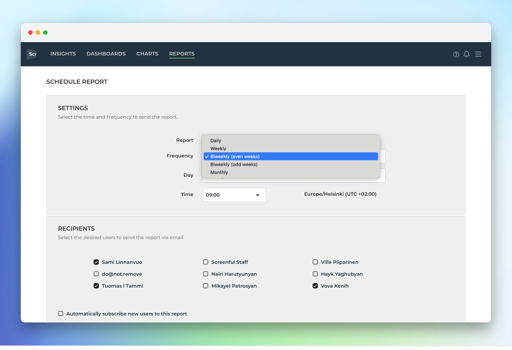
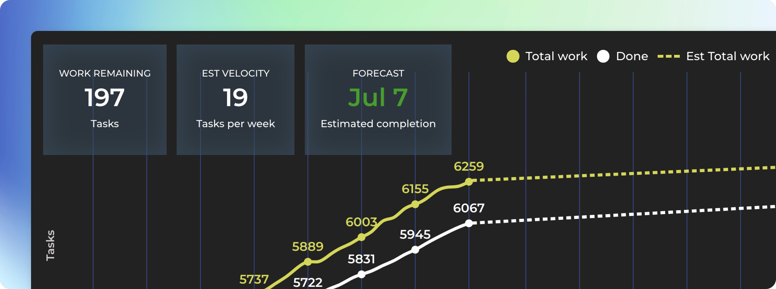
If you work in two weeks cadences as many Scrum teams do, you can now schedule reports to be sent biweekly . To schedule a report, click Schedule on top of the report in the report view and you will be presented the scheduling options:

You’ll notice that there are now options biweekly (even weeks) and biweekly (odd weeks) . Selecting even weeks allows you to receive the report on weeks 1, 3, 5, and so on. Selecting odd weeks will land reports on weeks 2, 4, 6 respectively.

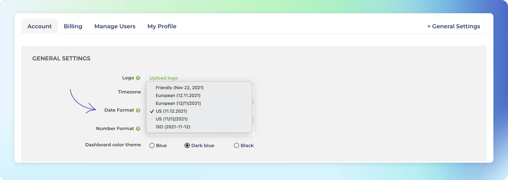
Customize reports with your own logo

You can now customize reports with your own logo. To add a logo to the report, you first need to upload the logo file on the Account settings:

Once you’ve uploaded the logo, you can enable displaying the logo in the report editor using the Show logo on footer toggle:

Once you’ve enabled the logo, it will appear on the report footer:

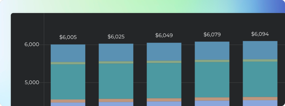
Improved columns support in the PDF export

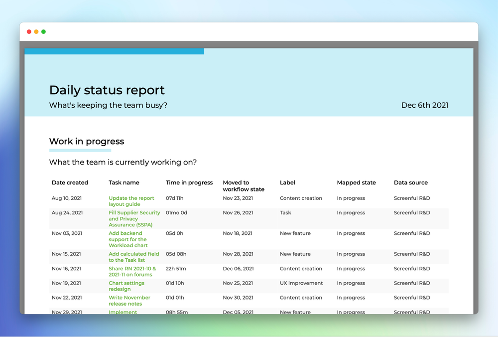
Previously, if you added more than a few columns in a Task list , some of those columns might have been cut out in the PDF export. We’ve now improved the layout of the PDF export so that you can fit many more columns. Here’s an example PDF export displaying 7 columns in a Task list:

The column widths are now dynamic based on the number of columns so go ahead and add all the columns you need!

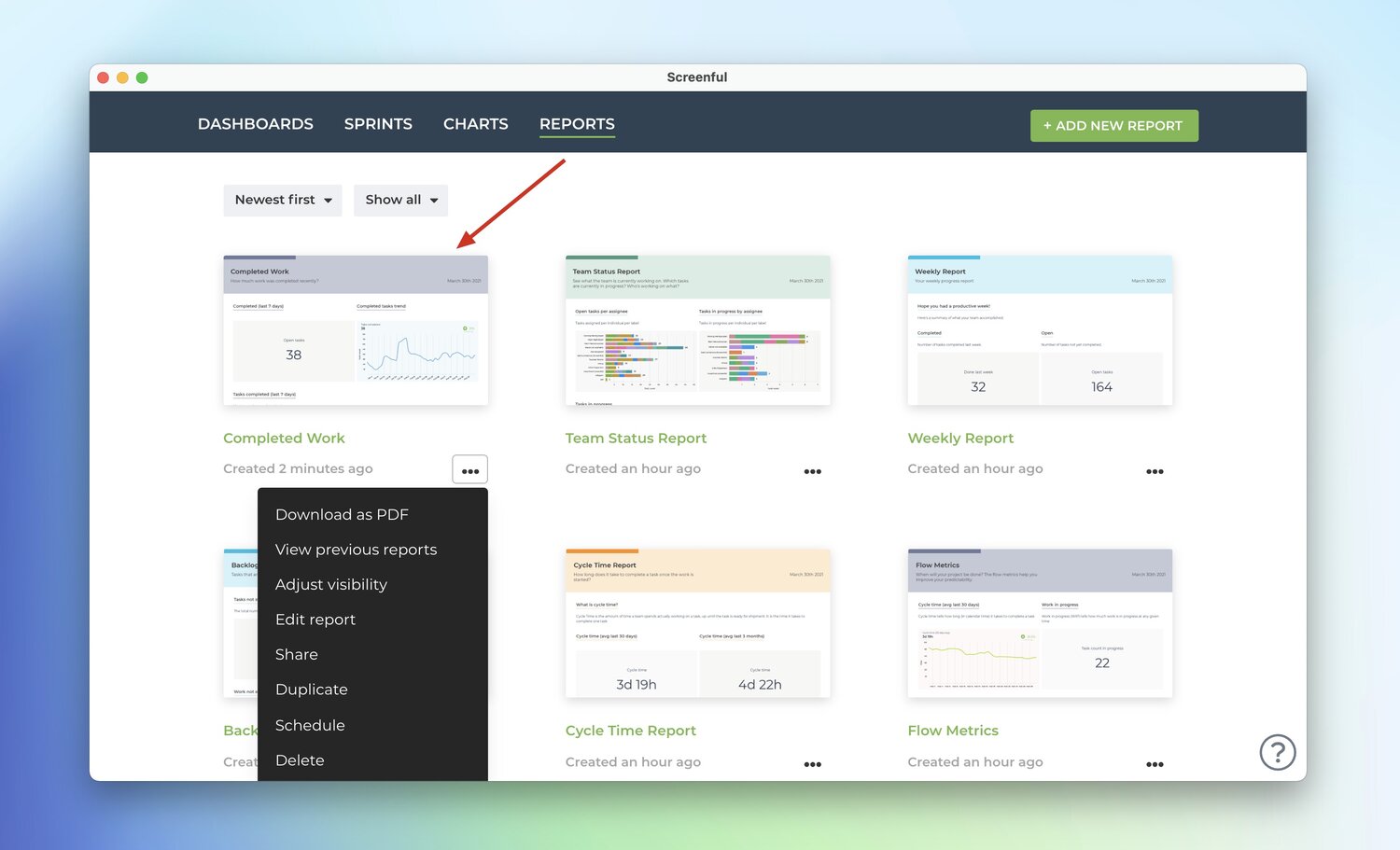
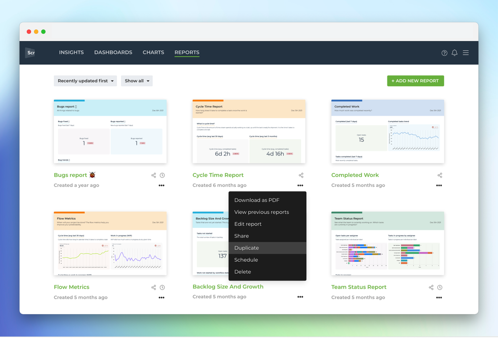
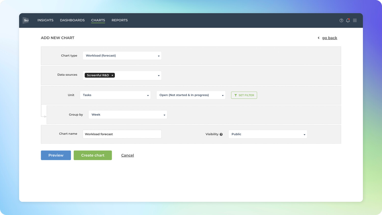
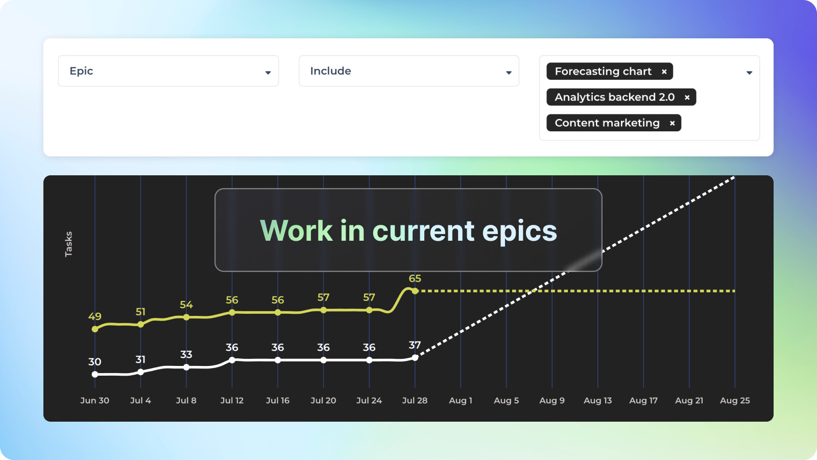
Duplicate a report with different data sources

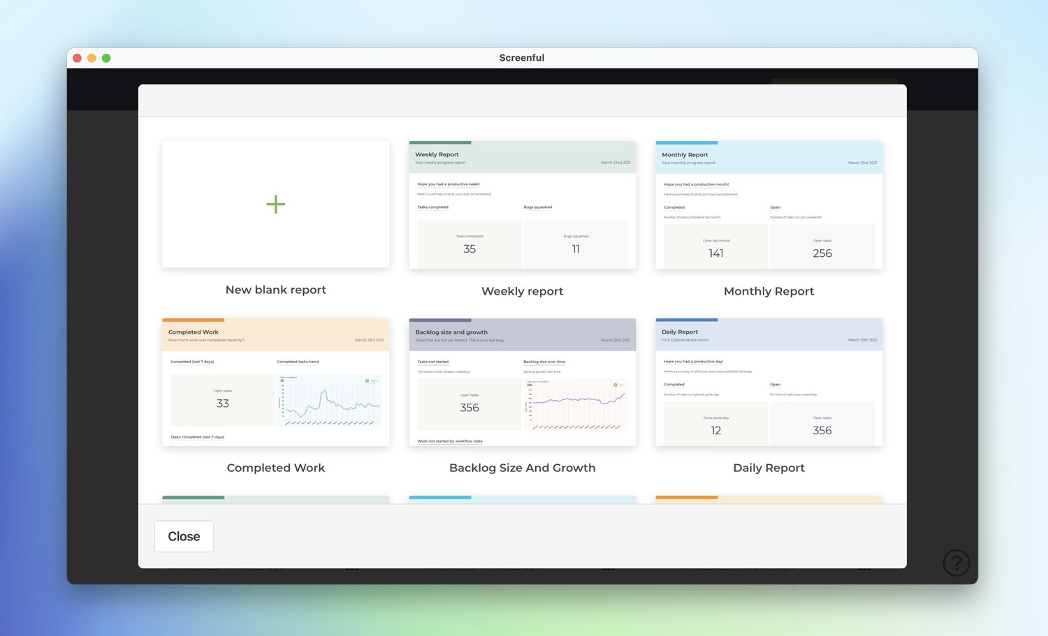
Let’s assume you have created a report with a specific set of data sources and want to recreate the same report with another set of data sources. The report duplication feature allows doing exactly that with just a few clicks. To get started, locate the report you want to duplicate and click the three dots menu:

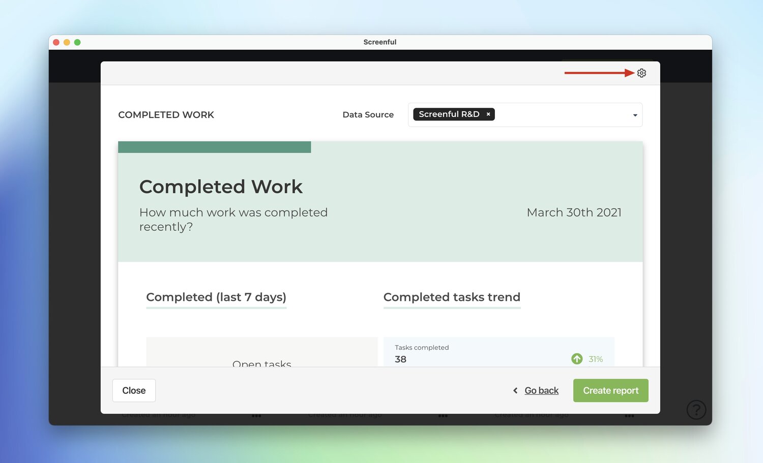
Selecting Duplicate from the menu opens a modal showing a preview of the duplicated report:

Notice that there is a dropdown menu on top which allows selecting the data sources for the duplicated report. The data sources you select in that menu will be applied to all of the charts in the new report.

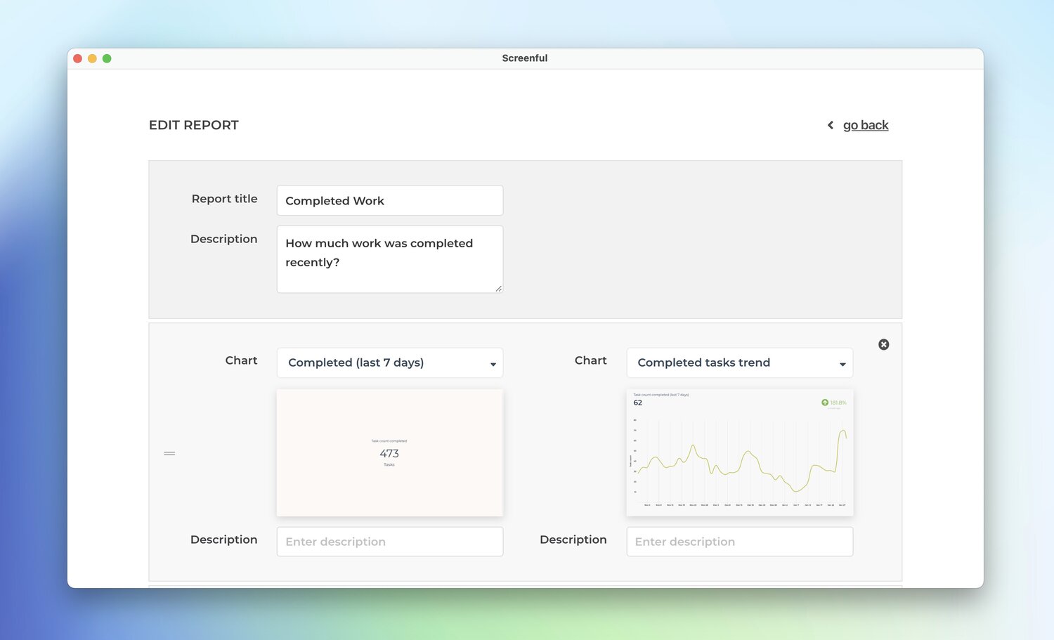
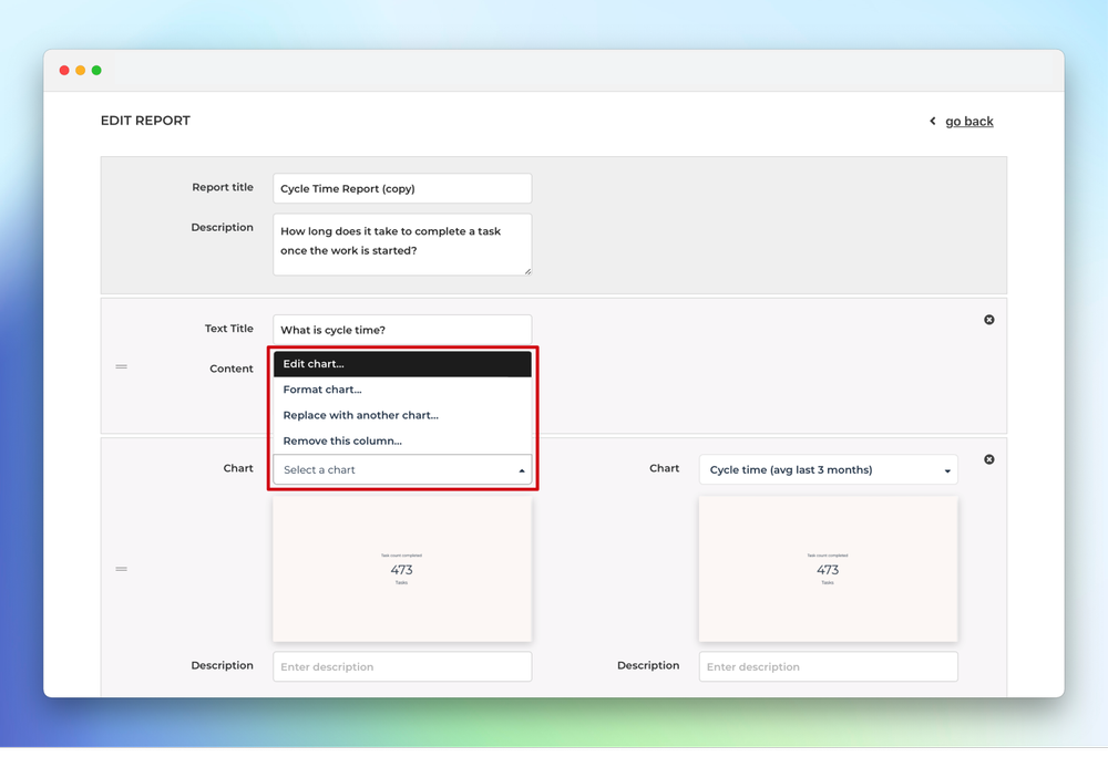
When you click Create report , the report editor is opened allowing you to further tune the report. For example, if you want some of the charts to use different data sources than others, you can now adjust the data sources of any of the charts individually:

Once you are happy with your new report, click Update report to save it as a new report.

Generate an archive of reports

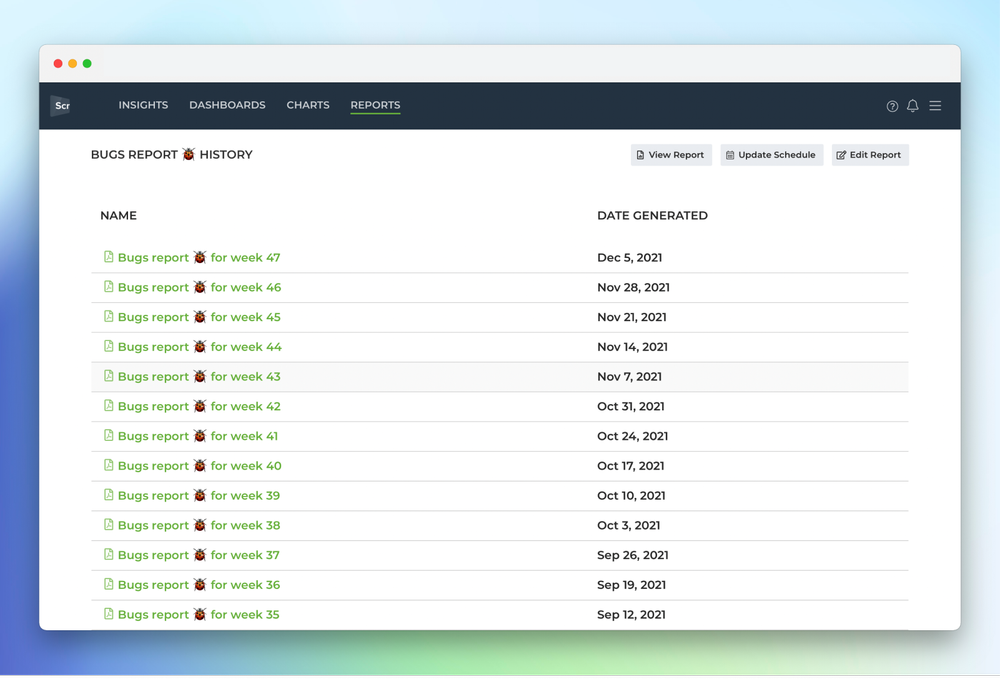
This one is more of a tip than a new feature since its been available since we first introduced the reports functionality. You may not have noticed it though and that’s why we wanted to highlight it here. Whenever you schedule a report, a copy of the PDF export is saved in your account and you can find them by selecting View previous reports from the context menu:

A list of previously generated PDF files is shown

This list contains all the scheduled reports since the very first one. It allows you see what was the status of your project at any point in history. You might find it handy in case you need to revisit on how things progressed during the project. For a project manager, that kind of record can be a life safer if any disputes arise afterwards.

To enable archiving of reports, just make sure that reports are scheduled at least to yourself!

When will it be done? Introducing the Workload (forecast) chart :crystal_ball:

If you’ve ever been managing a project of any kind, you know how important it is to have some idea of when all tasks are completed and you can expect the work to be done . Our newest chart, the Workload (forecast) was created to address that exact need.

The Workload (forecast) chart may look similar to the Workload (planned) chart which we released in our January release. While the Workload (planned) chart was based on the set start and end dates for tasks, the new chart makes forecasts based on your historical velocity . Instead of set start and end dates, it looks at how fast you’ve completed work in the past and makes predictions assuming your future delivery speed will correlate with your past performance.

Creating a Workload (forecast) chart

To create a Workload (forecast) chart, go to the Charts tab and click Add new chart on the top right corner

A modal is opened with a set of chart templates. Select Blank new chart and Workload (forecast) as the chart type. The chart editor opens with the chart settings

You can select one or more data sources, and any of your numeric fields as the unit. When you click Create chart , the chart is created and you can find it under the Charts tab under the top navigation.

Here’s an example chart

As with any of our custom charts, you can assign it to a dashboard or a report, or share it with others using the share links.

How to read this chart?

The chart shows a burndown of the remaining work on a weekly total until all the work is done. The leftmost bar is the current week and the rightmost bar shows the week when all the work is completed. As the work progresses, the remaining work reduces until it goes to zero.

At the top of the chart, you can switch between the Most likely , Optimistic , and Pessimistic scenarios. The most likely scenario assumes that you will complete the same amount of work (e.g. tasks or story points) as you’ve had on a median week in the past. In the Optimistic scenario, you will complete at least the same amount as the top 20% of the weeks in the past. In the pessimistic scenario, you will complete in the as much as the bottom 20% of weeks in the past. The percentiles are configurable in the chart settings so you can specify yourself what you consider most likely, optimistic, or pessimistic for your future delivery speed :smiley:

In the above example, there are 173 open tasks right now, and it will take 10 weeks to complete the current backlog of work to be done.

By default, this chart assumes that you will complete roughly the same amount of tasks per week as you have done in the past. It uses a 12 weeks median as the basis for the forecast but you can adjust it in the settings.

Introducing the Insights Forecasting section

We have added a new Forecasts section to the Insights tab . In addition to creating Workload (forecast) as a custom chart, you can also find it in the Insights tab.

The topmost chart shows your historical velocity as the amount of work completed per week . Below is the new Workload (forecast) chart that shows how long it takes to complete the remaining work based on the velocity history shown above.

These two charts help you to see your past velocity, and get a data-driven forecast for the remaining work. Instead of guess-work, you can use the data to make your own judgement!

Let’s Iterate! Introducing the custom burndown chart :chart_with_downwards_trend:

While we’ve had the burndown chart as part of our offering for quite some time, the functionality has been limited to the dashboards only. You haven’t been able to place a burndown chart into a report for example. Now we have iterated that concept and released a burndown chart as a custom chart! With the new custom burndown chart, you can create a burndown for any work scope and place it into a report or a dashboard.

Note : This chart is not a replacement for our current sprint planning features. This chart can be used for displaying a burndown of any work scope but it does contain tools for creating or managing sprints.

Creating a Burndown chart

  1. Navigate to the Charts tab.

  2. Click Add new chart.

  3. Click New blank chart.

  4. Select Burndown :fire: as the chart type.

The chart editor opens with the chart settings:

You can select one or more data sources, and any of your numeric fields as the unit.

The work scope is set with a filter. For example, if you want to see a burndown of a certain Jira epic, GitHub Milestone, or a set of groups in a Monday board, you can do so by setting the filter accordingly.

If you check exclude non-working days, the expected burndown will be flat during the weekends.

When you click Create chart, the chart is created and you can find it under the Charts tab under the top navigation.

Here’s an example chart:

As with any of our custom charts, you can assign it to a dashboard or a report, or share it with others using the share links.

How to read this chart?

A burndown chart shows how much work there’s left in the selected work scope. The vertical axis represents work items and the horizontal axis represents time. When you complete tasks, the chart shows how much work is still remaining.

The grey shape in the background shows the expected burndown. That’s how your burndown would look like if you completed the work evenly throughout the selected time period. The dark line is your actual burndown. The expected burndown provides guidance so that if your actual burndown differs a lot from the expected burndown, then you are getting behind (or ahead) of the plan!

The overlay on the top right shows you whether you are ahead or behind. It looks at how much work is completed vs left, and how much work has been added along the way, and provides a forecast of how much ahead/behind you are from the expected completion.

If work is added or removed after the burndown was started, they are shown as small circles in the timeline:

Notice that the numbers shown above the burndown line always display the work remaining. If you keep adding new work to the scope, your burndown may appear flat even though you complete tasks.

That’s it for this release. As always, we’d love to hear from you. Please do not hesitate to contact us any time at support@screenful.com if you have questions or feedback.

Customize charts with date formats, number formats, currencies, and more!

Don’t like the default appearance of a chart? We’ve got you covered since you can now configure almost any visual aspect of a chart such as colors, labels, and date and number formats. You can now tune even the smallest details to make your reports perfect. These adjustments can be found under the Chart settings.

Configuring date formats, number formats, and currencies

Different countries have different standard formats for numbers and dates. You can configure the date and the number format to match your local standards under the Account settings.

The Date Format menu contains the most common date formats

When you pick a date format, the selected format will be applied to all of the charts in the account.

The Number Format menu contains the most common number formats

When you pick a number format, the selected format will be applied to all of the charts in the account.

If your data represents monetary values, you can specify a currency under the Chart settings. In the Display Names section, you can select between Number and Currency

When a currency is selected, the associated currency symbol is shown in front of the numbers. Here’s an example line chart with currency set as “$” to represent the amount in USD. Both the Amount earned on the top left, and the tooltip display the selected currency symbol.

The currency setting is a chart specific feature. In the chart settings, you can specify which of the metrics are currencies. If your numbers represent a currency, you can make it more explicit by displaying it as the currency. The default for a numeric field is Number i.e. just a plain number, not a currency.

Adjusting the rolling window size in the line charts

When displaying data as a line chart, a sliding window is used to smooth away the daily fluctuations so that you can see the trend from the noise. The rolling window size is now configurable in the chart settings.

If you select 1 day rolling window, each point in the horizontal axis display the number of items (e.g. tasks created or tasks completed) per day. With 7 day rolling window, each point in the horizontal axis display the sum (or average depending on what metrics was selected) over the previous 7 days period.

Here’s an example chart with 30 days rolling window. When you hover the mouse over the chart, the tooltip shows the values for the previous 30 days period.

The longer the rolling window, the less variation there is in values, creating a smoother trend line. With smaller window sizes, you can see more details but the overall trend may get distorted by the daily fluctuations.

You can learn more about adjusting the appearance of charts from this guide.

Introducing the custom Forecasting chart :crystal_ball: :chart_with_upwards_trend:

We are excited to introduce our new custom Forecasting chart! It is a unique chart that you won’t find anywhere else. It provides data-driven forecasts for the completion of any work scope, such as a customer project or a new product release. The forecasts are presented as different velocity scenarios based on your team’s historical velocity.

The chart consists of two lines, a yellow line representing the total work and a white line representing the work done. As time progresses, the white line approaches the yellow line helping to see how much work is still to be done. The numbers can represent estimations, if available, or simply task counts.

The chart is divided into two parts. On the left side, you’ll see the progress so far. The right half of the chart shows the forecast for the future, represented as dotted lines. The overlays on the top show the amount of work remaining, the estimated team velocity, and the estimated completion date.

The forecasts are based on your team’s historical velocity. The Optimistic scenario expects that your team completes more work than in 80% of the past weeks. In the Most likely scenario, your team completes the equal amount as in the median week. In the Pessimistic scenario, the team completes only as much as 20% of the past weeks. The percentiles are configurable in the chart settings.

By default, the scope is all the tasks in the underlying data sources you’ve included. You can narrow it down to any subset of tasks by setting a filter, e.g. by label, epic, or assignee.

If you’re familiar with our Milestone Burnup chart, you’ll notice the similarities as it is based on the same principles. You have the total scope of work and the work done so far. You have the historical velocity and the forecast based on different scenarios. However, this chart contains several improvements, including:

  • The forecast also considers the historical growth of the total work in addition to the historical growth of the work done
  • The chart displays one scenario at a time (instead of all three at once) leading to a simpler representation
  • Since it is a custom chart, it can be added to reports in addition to dashboards

The new Forecasting chart is available as a chart template so you can create one with just a few clicks!

Here’s a tutorial video that shows this chart in action. You can learn more about this chart on the Tour page and the FAQ.

:pill: Reports on Steroids part 3: Send to selected users, new colors, and more

This is the third part in a series of releases related to improvements to our reports feature. You can find the first two parts here: Reports on Steroids part 1: Configurable summaries and here: Reports on Steroids part 2: Introducing the new report editor

Here’s an update of the latest enhancements to our Reports feature. You can now send a report to the selected users without scheduling it. Just select the recipients from the list and click Send now to selected users

This allows you to send a sample report to collect feedback from the recipients. After all, it’s good to hear their opinions on what the report should contain. Once you schedule the report, it will be sent automatically according to the set schedule.

Even if the report is scheduled, you can manually trigger the sending at any time. The selected recipients receive the report immediately via email. There’s a link to the live report online and a PDF export as an attachment.

You can find the scheduling options by clicking the three dots next to any of the reports in the list and selecting Schedule from the menu:

We have completely rewritten the PDF generation routines. Now the PDF matches the online report 1:1 so that it looks exactly the same as your live report. That also allowed us to squash some bugs and limitations in the PDF rendering experienced with the earlier PDFs, including the lack of support for some languages or character sets, and emojis :raised_hands:. We also improved the pagination for a better viewing experience.

Last but not least, we have introduced more color options for the report. You can adjust the color of the report by opening it for editing, and then clicking the three dots menu on the top right corner

The selected color is applied to the header and footer parts of the report.

That concludes our last release for this year. However, we have some much-requested enhancements in the pipeline. Stay tuned for more reports-related improvements in 2024 as we continue our mission to make reporting fun, easy, and automated.

That’s it for this release. As always, we’d love to hear from you. Please do not hesitate to contact us anytime if you have questions or feedback.