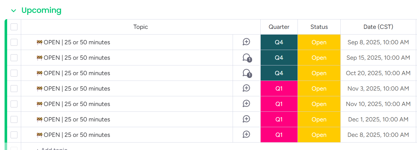
I have a column chart (pictured) which displays a count of programs we run each month. I want to modify the display so that the quarters of the year are evident, with each group of three months grouped into a quarter. Is this possible?

Not natively, perhaps with one of the 3rd party reporting apps?
Desiree - www.thecleverclovers.com
Hey Seth — great question! The chart widget doesn’t automatically group months into quarters, but we found a simple workaround that’s been working really well:
We added a Quarter label column (Q1, Q2, Q3, Q4) to our board. Each item gets tagged with the right quarter alongside its date. Then, when setting up the chart widget, we just group by that Quarter label instead of by month.
It takes a little upfront setup, but once the column is in place the roll-up into quarters is really clear, and the dashboards stay easy to read.

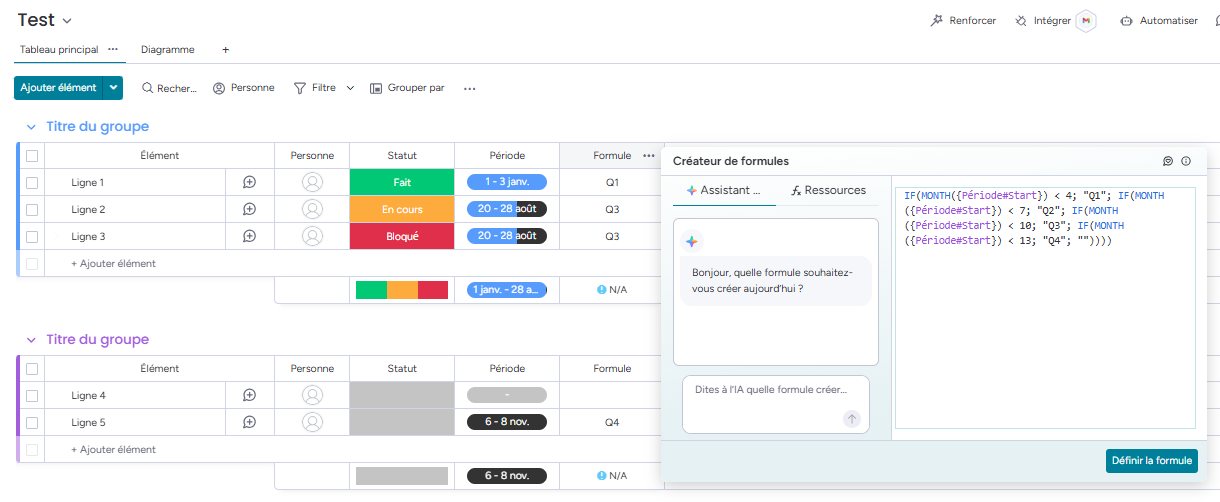
Hi, to avoid this upfront setup, why not use a formula to automatically select the Quarter and after to use it in a Chart. Something like this:

Thank you both for your replies!
@ProjectMastermind, your suggestion makes perfect sense, and as soon as I finished saying “Of course!” and slapping my head, I thought of @dmccarthy22710’s idea to make it even better.
I created two formula columns, Fiscal Year and Quarter, and the problem I have now is that I can’t organize the columns into quarters within years. So I can filter to only the current Fiscal Year, but then I don’t see any history.
Our FY runs July - June, so grouping the X-Axis by quarter doesn’t work. It would be nice if Monday allowed me to set a Year’s options the way it lets me set days of the week.
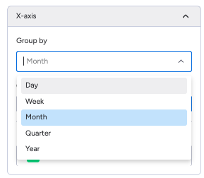
You can do this by setting the DATE column as your X axis. You’ll be able to customize the sort as ascending or descending x or y access.

Thank you… But I know about those options. My problem was that Monday didn’t understand that, in our Fiscal Year schedule, Jun is the first month of the year.
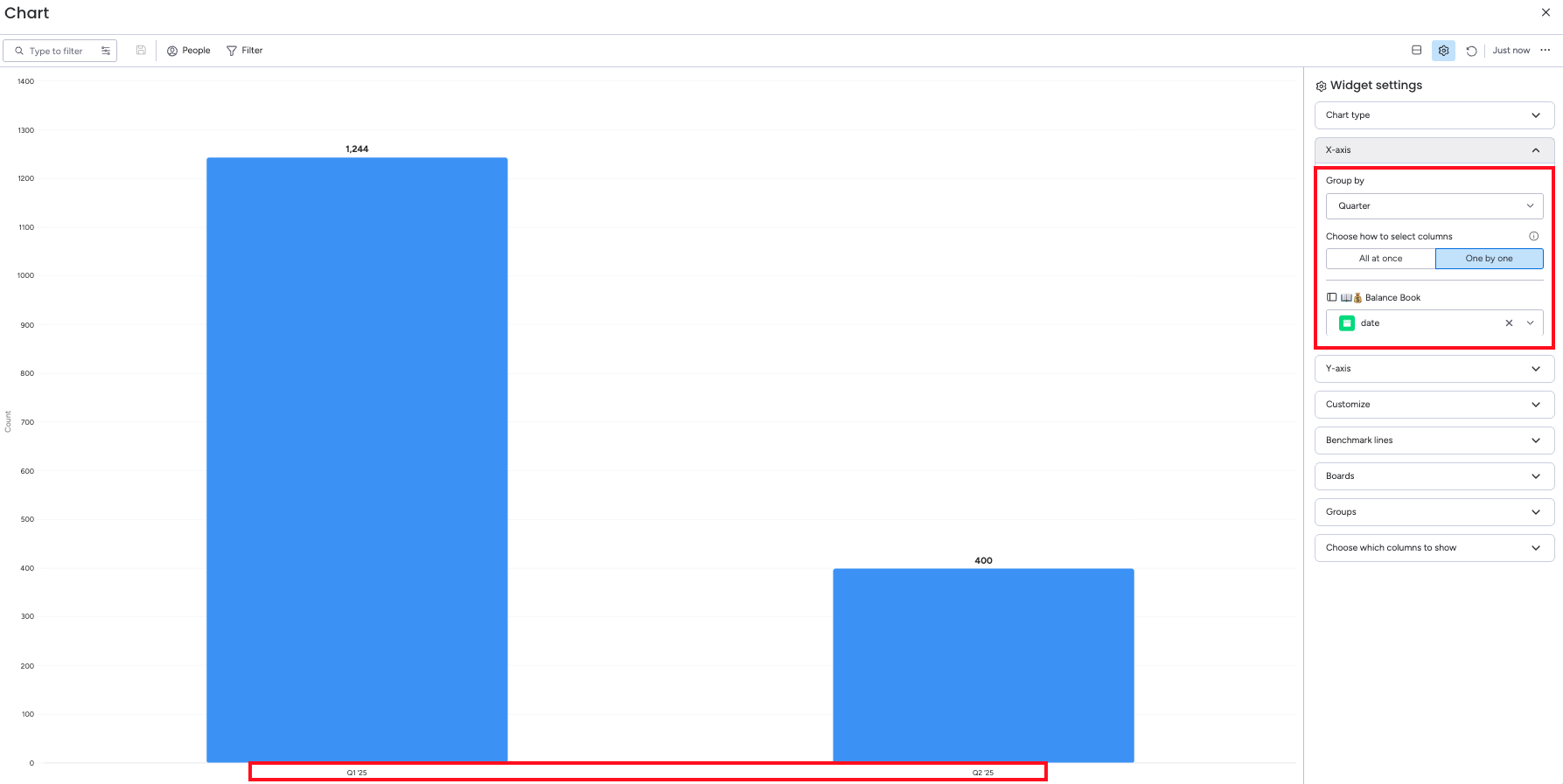
I was able to present what I needed by using the Customize feature inside the Widget settings. I grouped by Quarter on the x-axis and then manually re-ordered the Categories inside the Customize settings.
We are now in Q2 (Oct-Dec), so that’s the right-most column in my chart. I suppose I’ll have to manually reorder them every three months, but that’s not a significant issue. What I would really like is to have a multi-year chart by quarter, but I’m not sure if we’ll be able to do that.

You can reorganize and also re-label the date columns as well in the Customize area, if you want to do it via date.
Do you label your Quarter status so that July-September is Q1 Year1, Oct-Dec is Q2 Year1, Jan-Mar is Q3 Year1, and Apr-Jun is Q4 Year1? Then, the next Jul-Sep will be Q1 Year2?
If this is the case, and you want it labeled as such every year (or however you want), then you can have Workflows automatically populate the correct label for you depending on the date column. Or, you can just select the Q/Y manually. Then your chart will have the desired effect without you needing to manually customize the chart every 3 months.
Hmm.
My FYear and Quarter columns are Formulas, not Statuses. Seemed cleaner that way. And they are separate, but I can easily concatenate a third (FY2025 - Q1, FY2025 - Q2, etc). Are you saying that, if I do that, I can then use that column for the x-axis?